Widgets are great ways to represent data on your dashboard. You can select them according to your liking while representing your data visually So, how does one go about adding a widget to one's dashboard? You can pick your widget from a dropdown list like the one below. Create a new widget  These are the widgets one can pick from: These are the widgets one can pick from:
Post the selection, select your source report/worksheet: the data which you want to represent visually. Type the name of your widget and follow the rest of the steps with absolute ease. https://media.giphy.com/media/MXR860JFBAxQ91gdnr/giphy.gif To make it a little more detailed, the process of selecting every widget is divided into three simple steps: General This is the step where you set your widget's x and y values you're looking to represent visually. You can decide the measures and dimensions based on the type of widget you are creating. Some widgets also allow you to add a third category value to analyze your data further. Format Next up is the formatting, where you can set your prefix value like ₹, £ etc., your postfix like Kg, $, or any value which works for your data. You can even format your title's color and fix the commas according to the decimal system followed by your peers. Every type of widget supports different formatting options which can be used. Filter Now that you have your data in place, you need to add filters to go back to quick and easy. Firstly, select the column that is to be filtered, the type of filter and its values. You can choose from multiple filters. Select more than one filter at a time by clicking on the +(plus) icon. Don't forget to select either the AND or OR icon. All of the above is well and good, but how about going full power and customizing your widgets, with customized columns! To customize, click on the 'Add Calculated Column' - which will redirect you to a modal. Type your formula with an @ and a # for the selected column and voila your custom widget is ready for use. Please note, you can also Edit, Delete and Duplicate any widget using the below icon. Edit/Delete/Duplicate a Widget https://storage.crisp.chat/users/helpdesk/website/c78fea47d7641000/image_1tb80x.png Coming to the kind of widget and its use case, here is how each choice helps you analyze your data differently: Number widget If you're looking to assess sales numbers, number-wise standing of your projects, total costs or anything related to detailed figures- this is the widget to choose. Number Widget 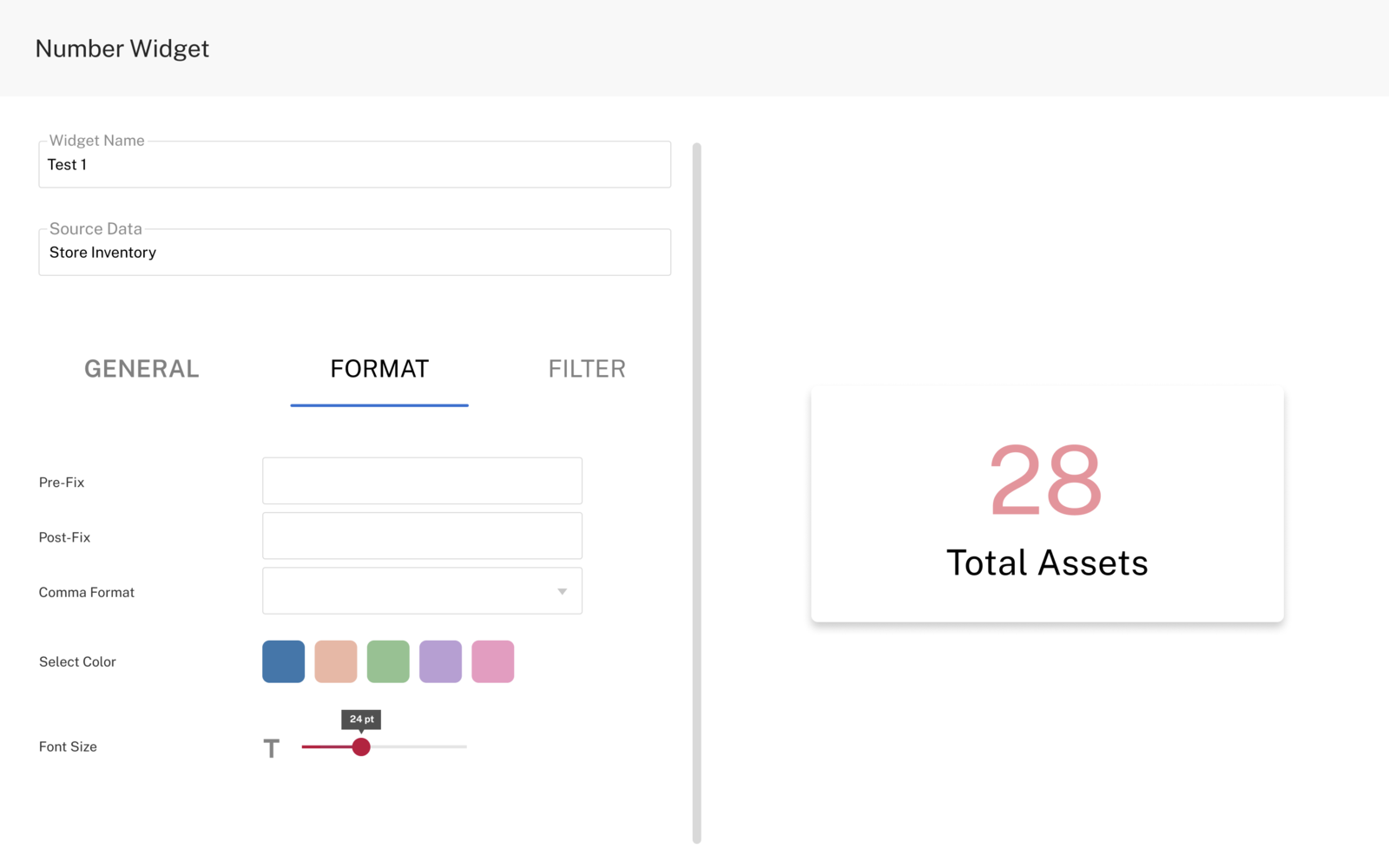 Table widget Table widgetIf you want to see your data in a table layout- with limited or multiple rows, using the table widget is the right approach. On GRID, you can add as many columns as are required. Though, we recommend sticking to what's most important. Table Widget https://storage.crisp.chat/users/helpdesk/website/c78fea47d7641000/image_1o8qhp6.png Bar Chart If you want to do a comparison of different groups or track daily changes in your data, the bar graph is the right choice. They are best when the changes are larger in scope and volume. Bar Chart  Line Chart Line ChartIf you want to track changes over short periods of time, line charts are better than bar charts. They can also be used to compare changes over the same period of time for more than one group. Line Chart  Donut Chart Donut ChartIf you want to see a circular representation of data where the size of each piece represents the proportion of each category, donut chart is an excellent choice. Donut Chart  Area Chart Area ChartArea charts are commonly used to showcase data depicting a time-series relationship. Here, the data is seen on the x- and y-axis; where values are plotted with data points connected through line segments. Area Chart  The process of setting every widget is the same while giving you a dashboard that is not only highly functional but extremely useful. The process of setting every widget is the same while giving you a dashboard that is not only highly functional but extremely useful. |